BICK’S PICKLES
Year: 2004/05
Client: Smuckers Foods of Canada
Design Firm: Dinnick & Howelles
Contribution: Designer/Production designer
Bick’s is a beloved Canadian name with strong recognition and brand personality, so it was critical that we respect its identity when tasked with redesigning all 65 SKUs. I was very aware of this necessity when helping Bick’s update the brand in line with evolving objectives, which we achieved through colour coding, font choice and a new ‘3-D’-style shield and logo. This was one of my first jobs as a designer, fresh out of school, but two of us spent three days researching just the right quirky, pickley font for Bick’s, and I’m still pleased with it today. That was an important lesson in how a little extra effort can make a real enduring impact.
GOLDEN TEMPLE
Year: 2004/05
Client: Smuckers Foods of Canada
Design Firm: Dinnick & Howelles
Contribution: Designer/Production designer
Client: Smuckers Foods of Canada
Design Firm: Dinnick & Howelles
Contribution: Designer/Production designer
I enjoyed a lead role in the design and production of this packaging project, from redesigning the logo to consulting and being involved in market research as well as assisting the art direction of the food photography. We had a pretty specific vision here and it was very satisfying to see it realized so effectively!
SOLAR SLEEVES
Year: 2016
Client: Levelwear
Design Firm: Accolade Group
Contribution: Designer/Production designer
Client: Levelwear
Design Firm: Accolade Group
Contribution: Designer/Production designer
Solar Sleeves are a tough product to describe, but the straightforward and economical line drawing here takes care of that nicely, while bold, basic text conveys the important facts without technical clutter. Simple, clean and to the point, this design stands out on the shelf and gives shoppers everything they need to know at a glance.
KEY FOB
Year: 2016
Client: Levelwear
Design Firm: Accolade Group
Contribution: Designer/Production designer
This particular project required a simple, cost-effective design that could serve Levelwear’s diverse range of key fob clients, which included major sports leagues such as the NBA, NHL and CFL as well as renowned golf companies and high-profile corporations. By assessing product requirements, I was able to come up with a die-line and two different designs that represented Levelwear’s evolving brand.Client: Levelwear
Design Firm: Accolade Group
Contribution: Designer/Production designer
watch band
Year: 2015
Client: Levelwear
Design Firm: Accolade Group
Contribution: Designer/Production designer
Client: Levelwear
Design Firm: Accolade Group
Contribution: Designer/Production designer
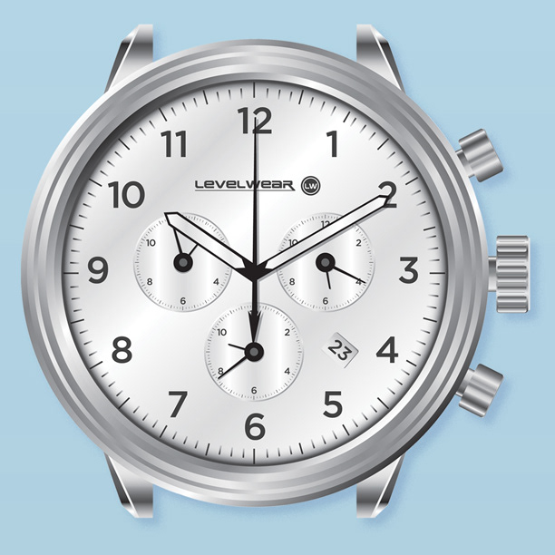
While I had made my own templates for packaging before, I’d never tackled one this complex. Involving a little Origami and a lot of patience, the sublimated watchband package here proved to be a real learning experience. Nonetheless, several paper mock-ups (and countless unprintable words) later, I had a design that displayed the product beautifully - and a new skill under my belt.
tazo tea
Year: 2004
Client: Starbucks
Design Firm: Student wrok
Contribution: Designer
Client: Starbucks
Design Firm: Student wrok
Contribution: Designer
So, why do I include student work in my portfolio after all these years? Aside from the fact that I still really like this one, it’s always been met with a great reaction when I’ve brought it out at an interview. At this point in my career, having done well in school might not mean much anymore but it’s nice to see that some of the work still holds up.
